


Choosing the right typeface for your brand is like selecting the perfect soundtrack for a movie. Similar to how a soundtrack sets the mood and enhances the storytelling of a film, a typeface communicates your brand's personality, values, and tone of voice. It is an essential part of your brand's identity. Here’s a quick guide to help you make an informed choice.
Understanding your brand identity
The first step is to have a clear understanding of your brand identity. What are your brand values? What message do you want to convey? Are you a traditional company that values reliability and trustworthiness, or a modern startup that prioritizes innovation and creativity? The typeface you choose should reflect these attributes.
Personality and tone
The typeface should reinforce the tone and personality of your brand. What a font communicates is a blend of its appearance and what it reminds you of when seeing it before. Serif fonts, for instance, are often seen as traditional, reliable, and respectable, making them a good choice for law firms, financial institutions, and academic establishments. Sans-serif fonts, on the other hand, are perceived as modern, approachable, and clean, ideal for tech companies, startups, and lifestyle brands.
In addition to where you’ve seen a font before, the appearance and shapes of the letters contribute to the perceived personality. A font that has smooth shapes is going to feel more friendly and informal. A font that is squarish is going to feel more industrial. Serifs make a font feel more formal and classical, and monospace fonts feel machine-like. Weight and italics (depending on the font), play a huge role in perceived personality. Light-weight fonts appear more sophisticated and delicate, and heavy-weight fonts often feel like they’re louder and more boisterous.
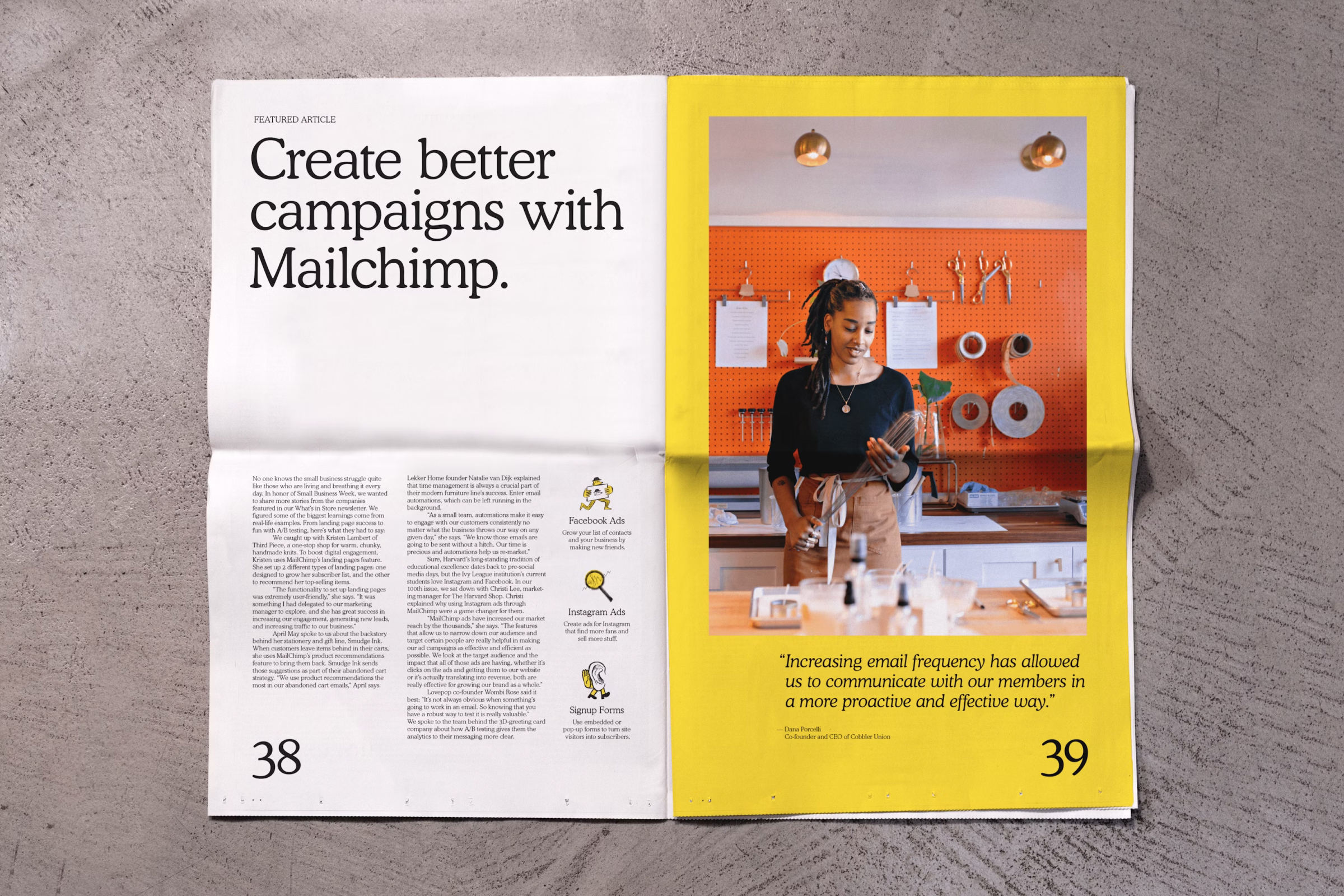
The personality of a font doesn’t always have to directly match the message; it’s also possible to complement and add to it. Mailchimp, a tech brand, uses a custom font called Means that is reminiscent of Cooper, a notoriously goofy font. It works great for them because they’re careful how they use it — pairing it with a buttoned-up sans serif, using the lighter weights that feel more refined and reserving it almost exclusively for headlines. Because of how it’s wielded, it communicates a relaxed atmosphere with a modicum of sophistication that differentiates Mailchimp from other tech brands.
Consider the context
A number of fonts are designed for specific use cases and their appearances are optimized to be readable in those specific situations. Retina, designed by Frere Jones, was originally designed to be readable at tiny sizes in financial print applications and the weird interior corners, called inkwells, prevented the ink from pooling in the corners. OCRA was originally designed to be read by both machines and by humans, which is why each letter has a distinct shape.
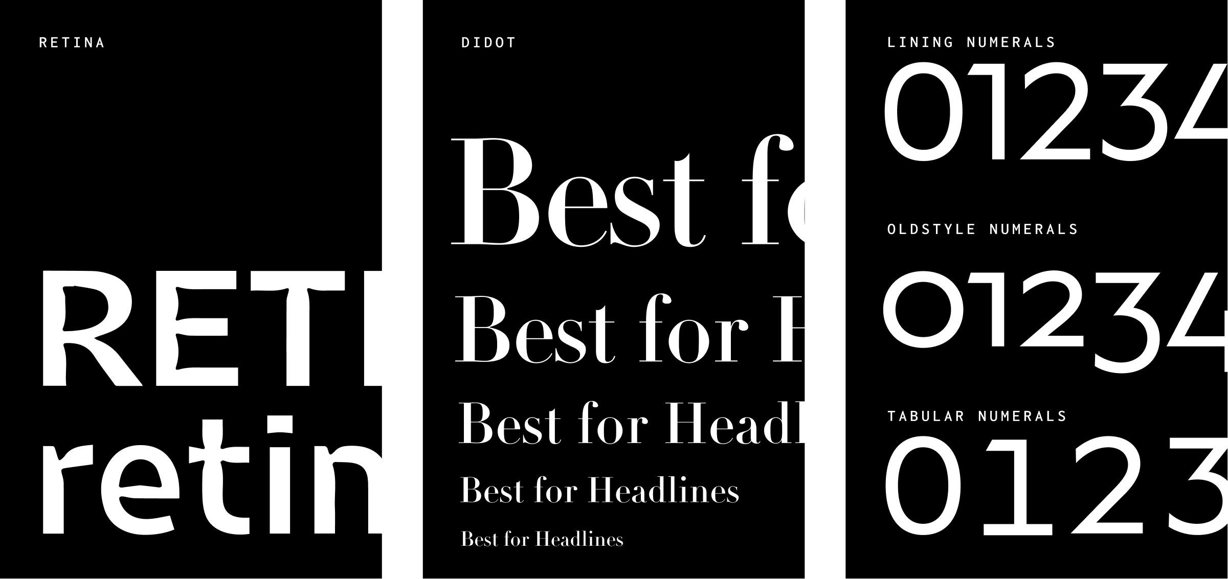
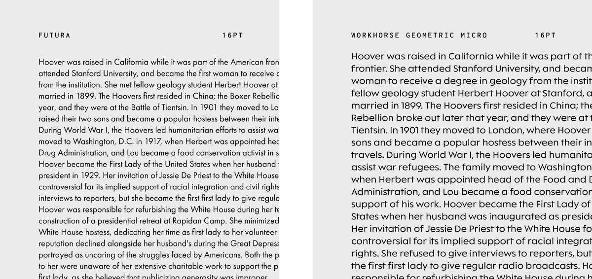
Aside from those specific fonts, certain characteristics make some fonts more ideal for certain applications. Didot is an incredible font at large sizes, but you would never want to make it too small or the thin parts would disappear. Futura is awesome for headlines and all-caps settings, but tends not to be great for copy because the lowercase letters are small relative to the capital letters making it more difficult to read.
In addition to visual characteristics, fonts are software, and like other software features can vary between fonts. As an example, some fonts are built with more than one set of numbers, language support and weight ranges. If you’re displaying financial information you’d be well-served by having a font with tabular numbers: numbers that occupy the same width, so columns of numbers will line up and be more legible.
Many fonts are designed for specific applications in mind. Using fonts in a way they were intended to be used will help their strengths in your favor.
Looking for fonts in the right places
Not all fonts are created equal, and prices range wildly depending on use case, source, etc. Depending on your situation there are 3 general sources to find fonts: Google fonts, subscription-based sources (Adobe & Fonstand) and buying directly from independent foundries.
Google Fonts
Google Fonts are free which makes them very ideal for startups and people who like free things. The main downside is the quality varies pretty wildly from font to font and it takes expertise to know which ones you can count on and which ones are hot garbage. Luckily there are a number of resources like Beautiful Web Type and Typewolf that help you find the good stuff.
Subscription-based sources (Adobe, Fontstand)
There are currently a couple sources that offer subscription-based fonts at a reasonable price: Adobe and Fontstand to name a few. The obvious trade-off here is that you don’t actually own the font, but that can be very ideal if your project is short-lived or likely to change. The selection can be limited, but the price is hard to beat and there are some very classic reliable fonts available this way. When a client has a small budget this is often my go-to source for fonts because the quality is better than Google Fonts but the price is still very affordable.
Direct independent foundries (Klim, Hoefler, etc.)
The most impactful type is often found at independent type foundries like Klim, Hoefler, House Ind., Commercial Type, etc. Not every independent type foundry is good, but the good ones consistently produce exceptional fonts. There isn’t a standard for pricing so depending on your company size or project independent foundries can range wildly in affordability. Most independent foundries allow you to purchase fonts with a one-time fee so they can be ideal for rebrands you intend to last for years or decades.
When starting a project it’s a good idea to discuss a budget for fonts with your design team for your specific project. Switching fonts down the road can drastically increase the workload for your design team and create problems.
Conclusion
Choosing the right typeface for your brand is a nuanced process that requires consideration of your brand’s values, context, and how it will be perceived by your audience. By following these guidelines, you can select a typeface that is visually appealing and most importantly amplifies your brand's identity and message.


